Kaplan Test Prep
Kaplan Test Prep Redesign
Transforming a legacy e-commerce site.
Overview
Kaplan Test Prep’s website is a major revenue engine, with thousands of students visiting daily to purchase courses, quizzes, and other prep products. When I joined, the site was in urgent need of a revamp: most pages were hard-coded without a proper CMS, design consistency was lacking, and the overall user experience was subpar. As project lead, I partnered with two other designers to redesign the e-commerce site—focusing on making it mobile-friendly, implementing consistency across pages, and delivering a smoother, more user-centric experience.
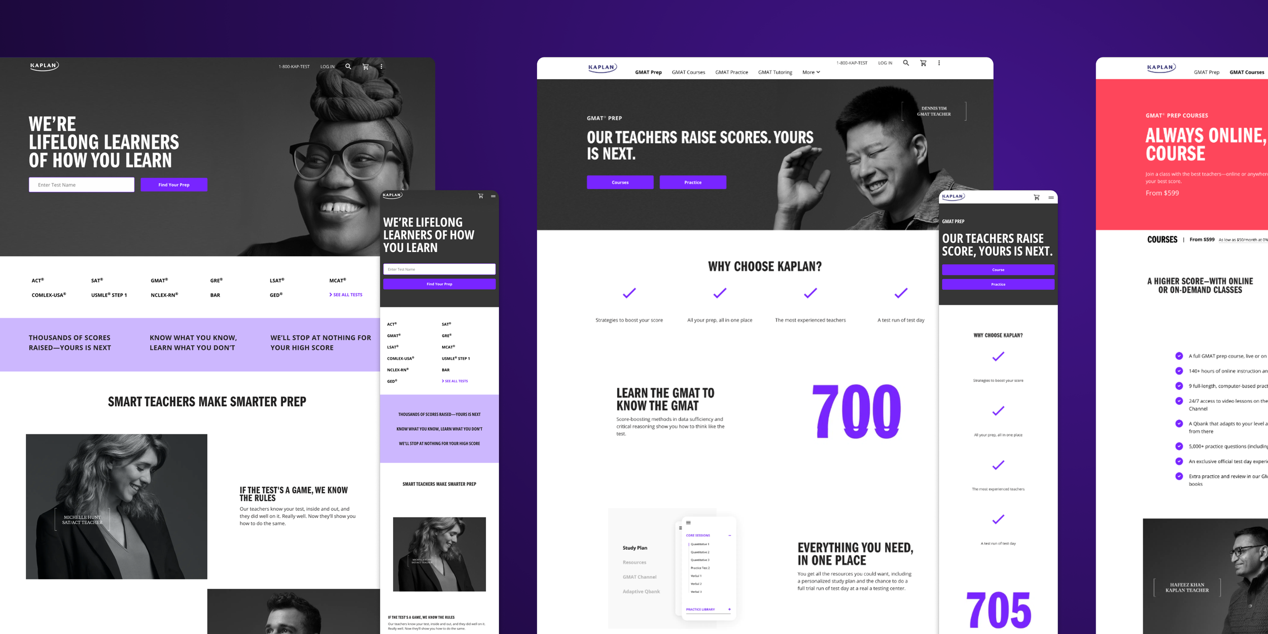
Old State
The legacy site was riddled with problems: competing CTAs fought for attention, design inconsistencies undermined trust, user flows were convoluted, and launching new pages demanded excessive time and engineering effort.

Approach
Our approach was multifaceted: we conducted an inventory of UI elements, analyzed core funnels and flows using Google Analytics, performed a heuristic evaluation, and ran user tests on the existing site. From there, we kicked off the design process with multiple rounds of user validation. Partnering closely with engineering, we developed a modular component framework that empowered content creators to build new pages independently—eliminating the need for ongoing engineering support.
Highlights

New Homepage
The redesigned homepage was structured to guide users quickly to the right test page while highlighting Kaplan’s value props.
Predictive search with a single CTA
Secondary navigation to top pages
Clear headline about Kaplan
High-level value props
Lead capture
Improved Navigation
We simplified navigation by removing long dropdowns and bulky mega-menus.
Predictive search with a single CTA
Secondary links to top pages
SEO-friendly mega-menu, hidden for most users
Easier Product Comparison
Rather than flooding users with choices, the new design enables clear, side-by-side product comparison.

Improved Consistency
A modular framework streamlines development and enforces cohesive design standards.
Outcome
The new website was rolled out incrementally, running A/B tests against the legacy version. Results showed up to a 25% lift in conversion rates (depending on the test page) along with increased traffic. The modular infrastructure also cut page-creation time to a fraction of what it had been, freeing engineering resources to focus on higher-priority initiatives.